Text in Frame
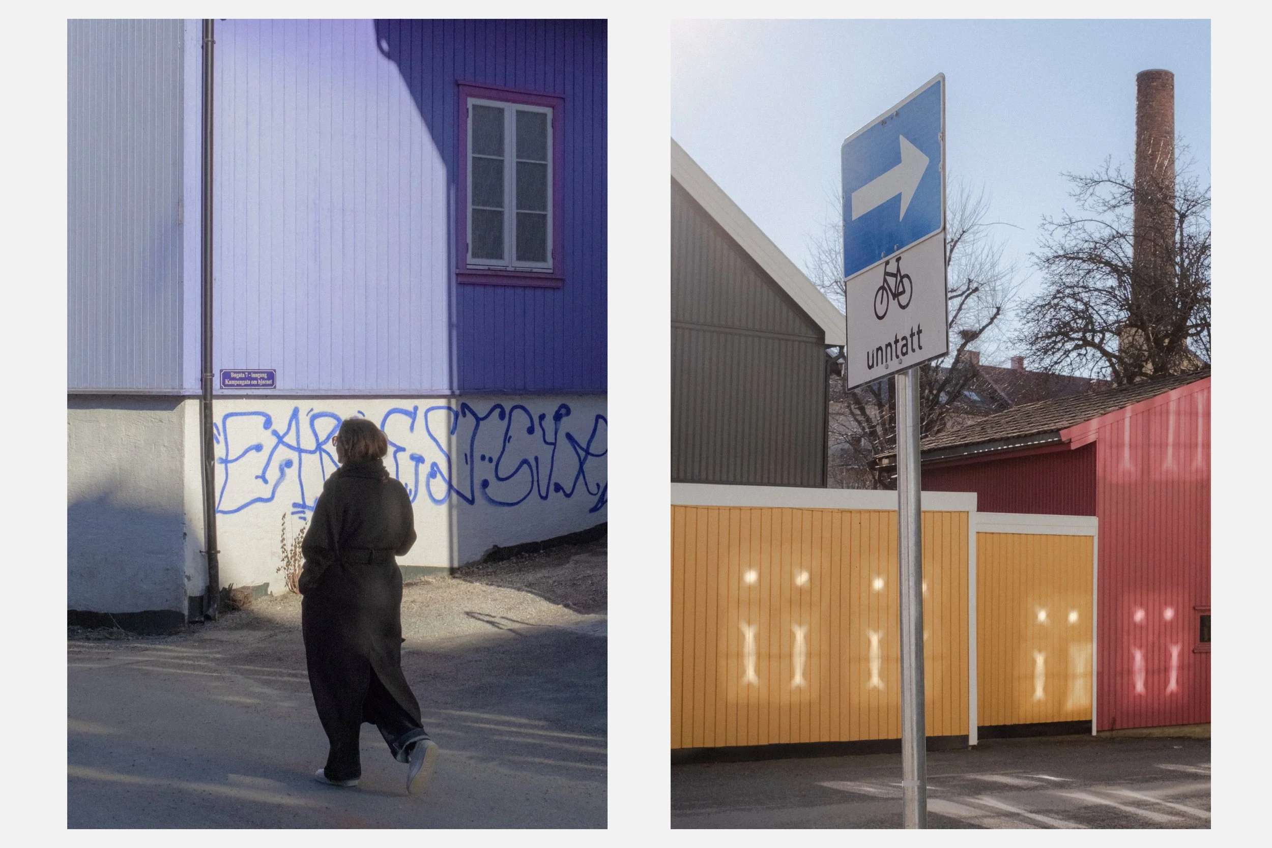
Coming from a graffiti background, it felt natural to bring text into my street photography.
Letters, words, signs on walls, they’ve always been part of how I read the street. Early on, I started playing with text in the background as a way to interact with the subject in the frame.
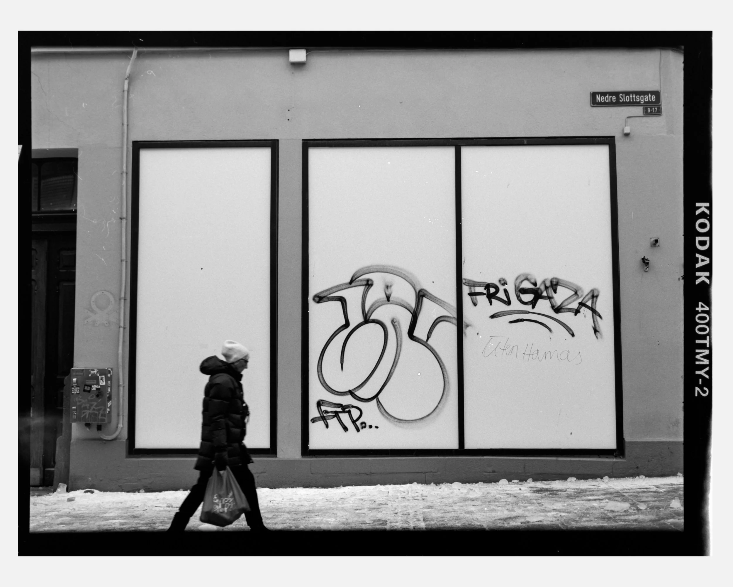
At first, I thought I was doing okay. Some images worked on the surface. But something often felt off. The balance. The weight. The explanation baked into the image.
More often than not, the photograph collapsed under the presence of the text. All attention went straight to the words, and whatever subject I was trying to say something about quietly disappeared.
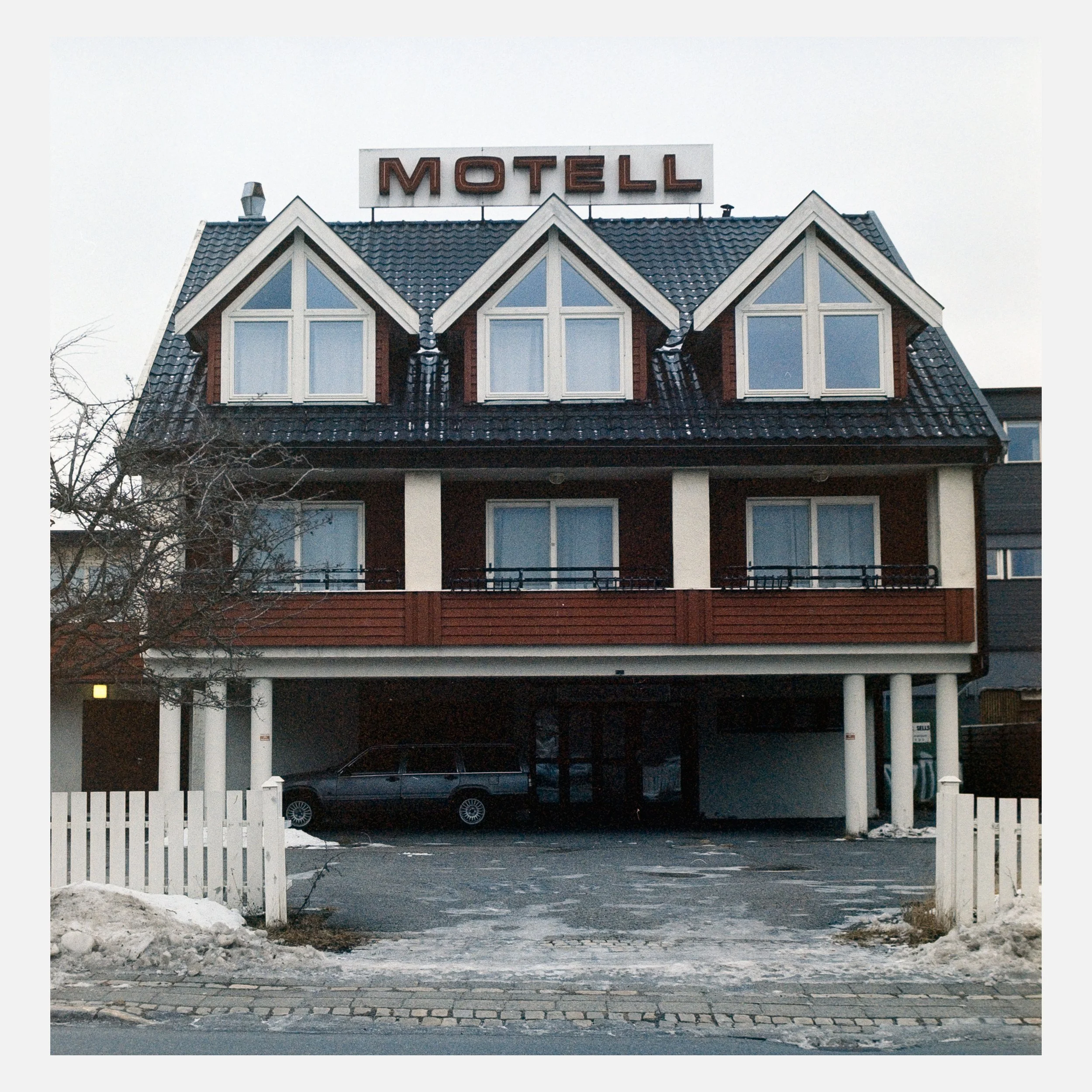
Used well, consciously and carefully, text can be a powerful tool in photography. Used poorly, or unnoticed, it can quietly ruin an otherwise strong composition.
Humans are wired to read. When we see an image that contains text, our eyes are pulled there instantly.
It’s magnetic. Like a sponge, it absorbs our full attention and becomes the first thing we “read” in the photograph.
That makes text incredibly dominant. If your intention is for the subject to be read before the text, you’re taking on a difficult task.
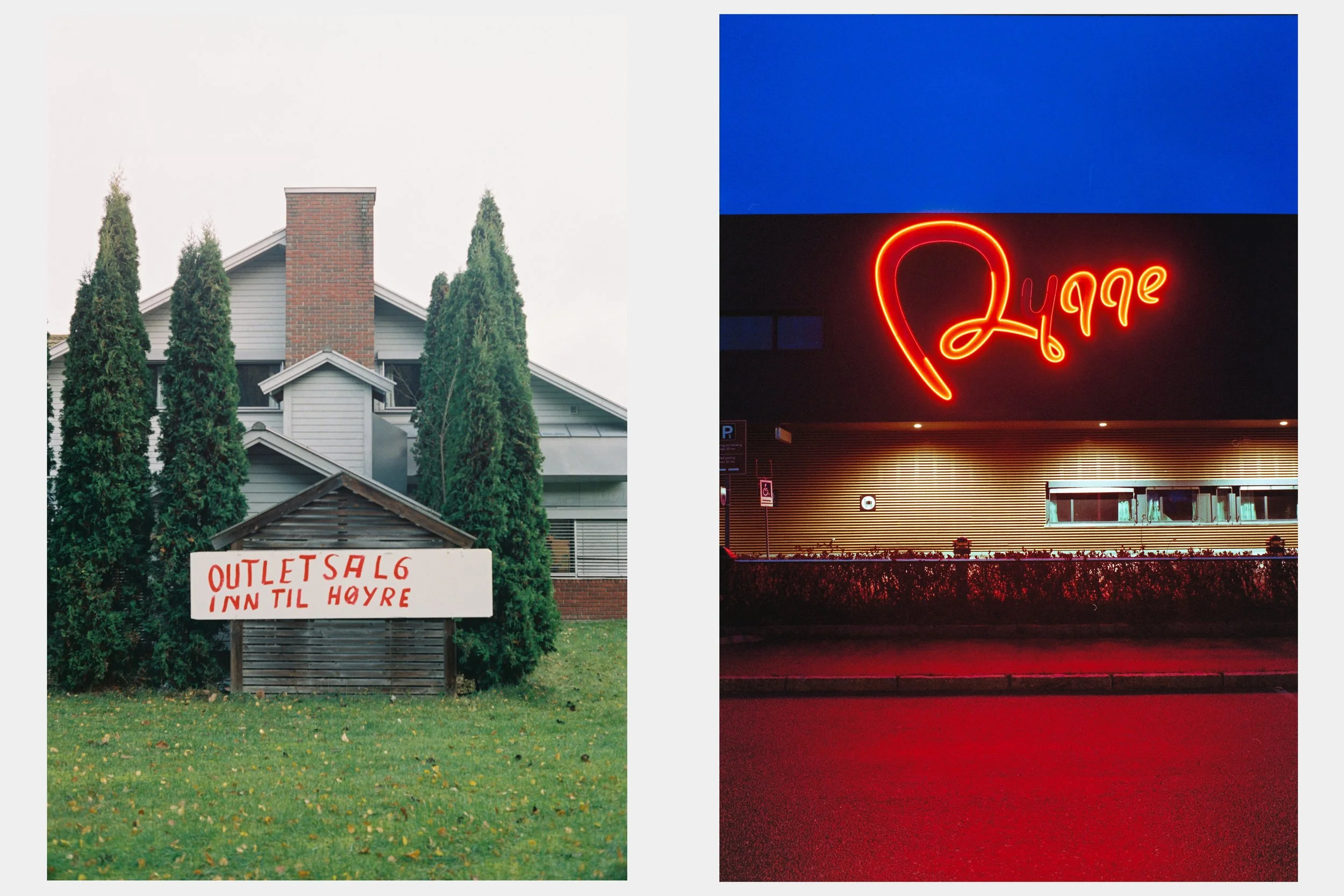
Sometimes the text complements the subject. Sometimes it explains too much. And sometimes it simply shouts.
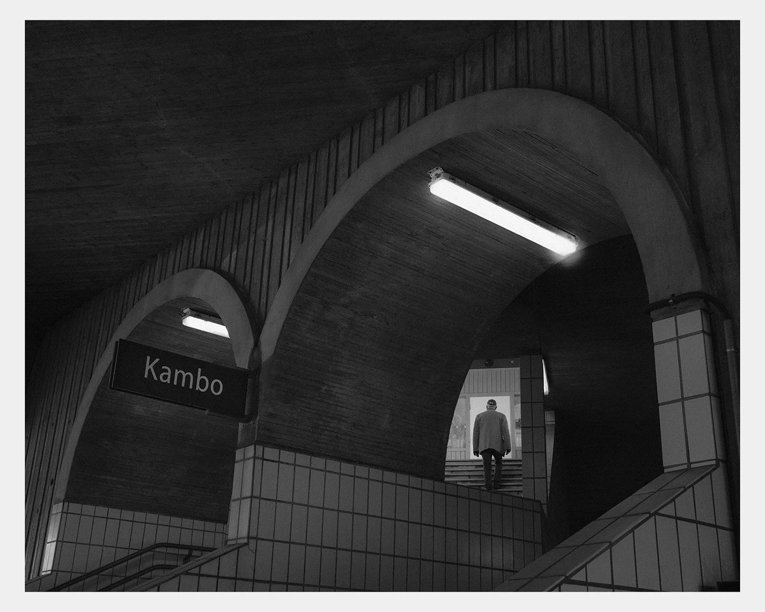
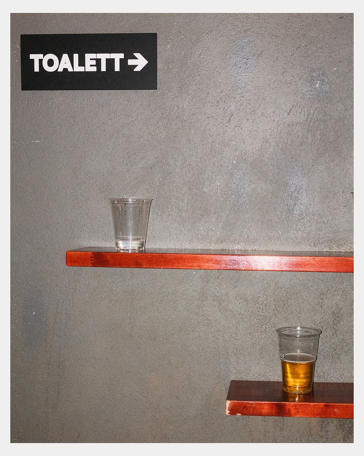
I’ve found that text can offer instant storytelling, hints about place, time, or mood without the need for a caption. It can create irony or tension when paired with a human presence.
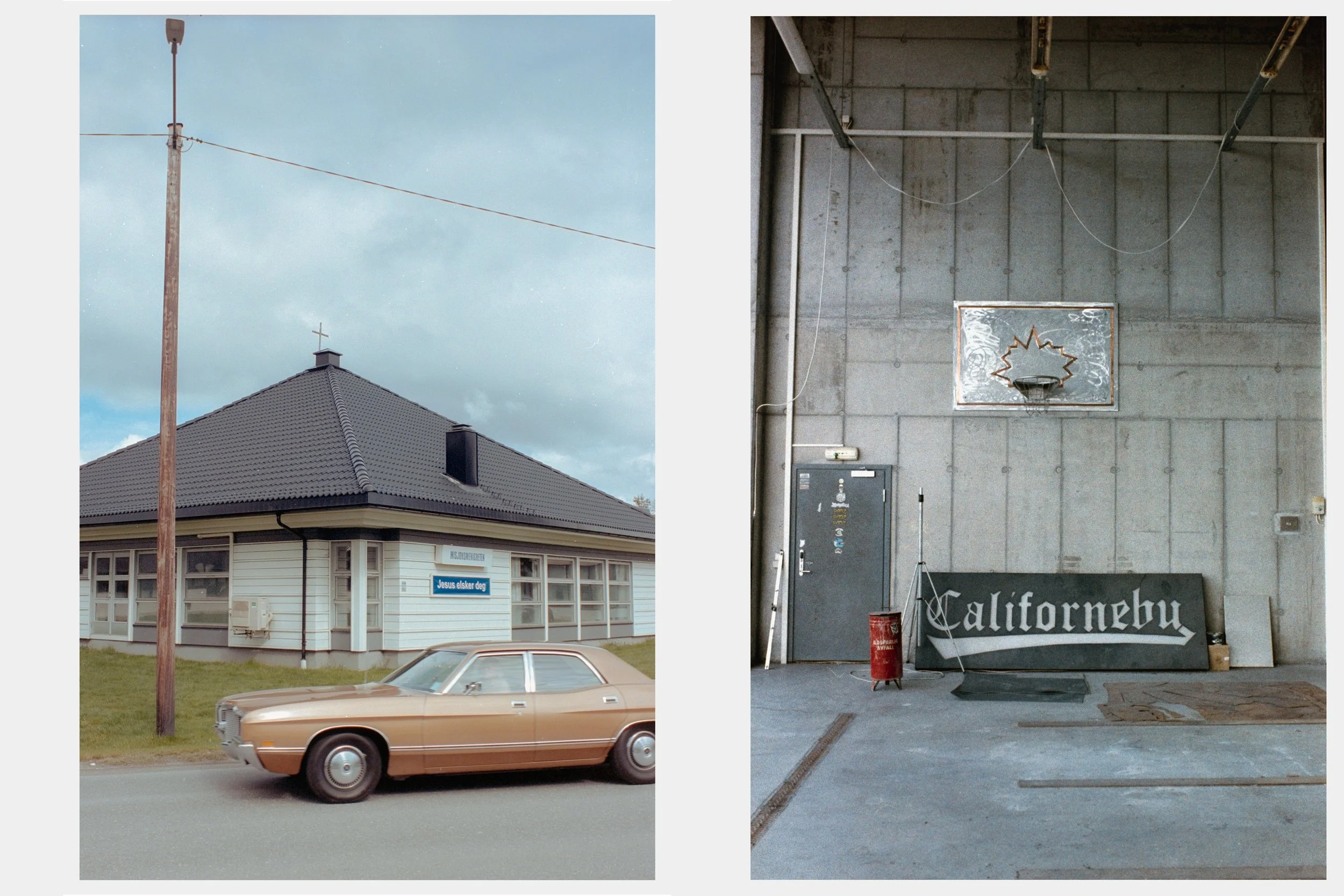
Graphically, it can add strong shapes and structure to a frame. But it can also limit interpretation, making an image feel closed rather than open.
What could have been ambiguous becomes literal. What could have felt timeless suddenly feels dated.
Over time, I realized something else: I wasn’t really seeing text at all. Maybe that comes from years of being surrounded by graffiti, letters on walls were just… normal. Visual noise.
I went a long time not noticing them, and when I did, they often took over the frame without me intending them to.
Lately, I tend to work around text rather than with it. I exclude it more often. Not because I dislike it, the love for letters is still very much there, but because I’m more cautious now. More aware.
I’d rather introduce text slowly, intentionally, than let it dominate by accident.